Images
Basic Html for a Picture
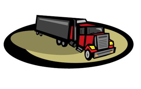
How to put a picture on your HTML page:
<img src="truck450.jpg" alt="Picture of a tractor trailer">
How to add a inline style to control the size of the picture and add a border:
<img src="truck450.jpg" alt="Picture of a tractor trailer" style="border:solid 1px black;width:225px;height:142px">
You can use a selector instead of the inline style.
You can make 2 different sizes of the same picture so you can use one for the bigger screen and one for the smaller screen. Here is the HTML with a id selector instead of
the inline style.
<img src="truck450.jpg" alt="Picture of a tractor trailer" id="truckpic">
How to put 2 pictures beside each other and then make the third picture appear on the next line below the 2 pictures beside one another. This works better if
you are using a bigger screen because I made it stack up on the mobile.
<img src="truck450.jpg" alt="Picture of a tractor trailer" id="pic1">
<img src="truck450.jpg" alt="Picture of a tractor trailer" id="pic2">
<img src="truck450.jpg" alt="Picture of a tractor trailer" id="pic3">
CSS
#pic1 {
float:left;
}
#pic2 {
float:right;
}
#pic3 {
clear:both;
}
@media screen and (max-width: 999px) {
#pic1 {
float:none;
}
#pic2 {
float:none;
}
}
I floated one picture left and the other right and then cleared both on the third picture so it aligned right on the next line. Clear:both; clears the float
when you floated one left and one right. I could have floated both pictures left and then put clear:left on the third picture. I added a different id
selector to the three pictures so I could style them with css. Pictures follow the flow of text and you don't have to float them to make them line up
beside each other but you can like I just demonstrated. On the mobile CSS sheet, you would change the float:left to float:none;
to help make it all stack up.
How to make text fill in beside the picture:
Lorem ipsum dolor sit amet, consectetur adipiscing elit. Mauris orci odio, fermentum eu fermentum et, laoreet accumsan purus. Aenean aliquet odio odio, in
efficitur augue sollicitudin eu. Aliquam ornare vestibulum ligula, vitae rutrum neque dignissim at. Praesent vestibulum lorem nec arcu pellentesque lacinia.
Cras nec sem sit amet nulla iaculis molestie. Lorem ipsum dolor sit amet, consectetur adipiscing elit. Mauris orci odio, fermentum eu fermentum et, laoreet accumsan purus. Aenean aliquet odio odio, in
Cras nec sem sit amet nulla iaculis molestie.Praesent vestibulum lorem nec arcu pellentesque lacinia.
Cras nec sem sit amet nulla iaculis molestie. Lorem ipsum dolor sit amet, consectetur adipiscing elit. Mauris orci odio, fermentum eu fermentum et, laoreet accumsan purus. Aenean aliquet odio odio, in
efficitur augue sollicitudin eu. Aliquam ornare vestibulum ligula, vitae rutrum neque dignissim at. Praesent vestibulum lorem nec arcu pellentesque lacinia.
Cras nec sem sit amet nulla iaculis molestie.Praesent vestibulum lorem
Cras nec sem sit amet nulla iaculis molestie. Lorem ipsum dolor sit amet, consectetur adipiscing elit. Mauris orci odio, fermentum eu fermentum et, laoreet accumsan purus. Aenean aliquet odio odio, in efficitur augue sollicitudin eu. Aliquam ornare vestibulum ligula, vitae rutrum neque dignissim at. Praesent vestibulum lorem nec arcu pellentesque lacinia. Cras nec sem sit amet nulla iaculis molestie.Praesent vestibulum lorem
HTML
<p class="paraone">

<img src="truck450.jpg" alt="Picture of a tractor trailer" id="pic4">

THE TEXT BESIDE THE PICTURE ALWAYS GO HERE

</p>


<p id="paragraphfour">

Next paragraph or block element that goes under picture and text beside it.

</p>
CSS
This CSS and the mobile CSS is in the head section in <style></style> tags.
#pic4 {
float:left;
}
paragraphfour {
clear:left;
}
I floated the picture left allowing text to fill in next to the picture. I entered the next paragraph that comes after the picture and text. The I cleared
the float on that paragraph. The picture has to be coded before the text that fills in beside it even if you float the picture right so the text is
on left, you still have to code the picture before text. On the mobile sheet you change float:left; to float:none; to make it stack up.
I also had to apply
box-sizing:border-box and change the width of the img tag to 100%. The pictures were causing the mobile sheet to look bad.
I used the <head></head> for the css so it just applied to the pictures on this page.
<style>
@media screen and (max-width: 999px) {
img {
width:100%;
}
#pic4 {
float:none;
}
* {
box-sizing:border-box;
}
}
</style>